IRCTC App Case-study
Duration: July 2025 – August 2025
Role: UX/UI Designer
Booking a train on the IRCTC app feels harder than it should. Too many steps, unclear labels, and a messy layout make the process stressful — especially during peak times.
Introduction
Introduction
Booking a train on the IRCTC app feels harder than it should. Too many steps, unclear labels, and a messy layout make the process stressful — especially during peak times.
The Struggle
Booking a train ticket on the IRCTC app can be confusing and stressful. With too many steps, unclear labels, and a cluttered interface, even experienced users struggle—especially when tickets are in high demand.
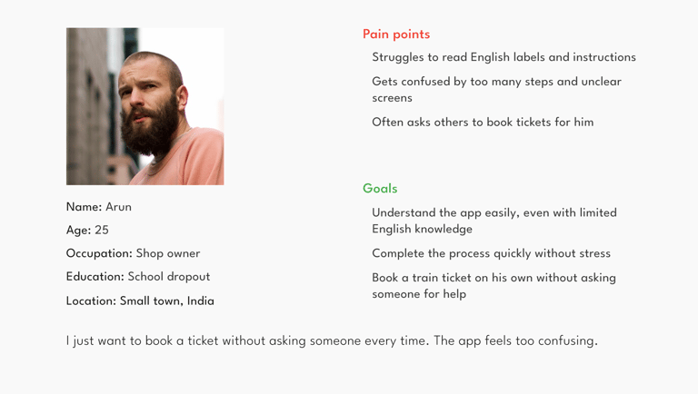
User Persona
UX Goals
Make the ticket booking process faster, clearer, and stress-free. Users should be able to log in easily, find trains without confusion, and complete bookings with fewer steps and less clutter.
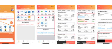
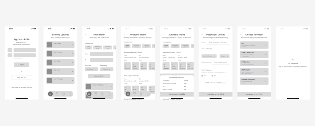
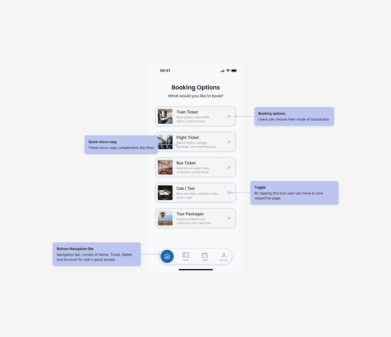
Wireframes
The wireframes focused on simplifying the journey from login to booking. Every screen was stripped down to what truly matters — fewer steps, clearer actions.
Simple login with mobile number or IRCTC ID. Quick access without confusion.
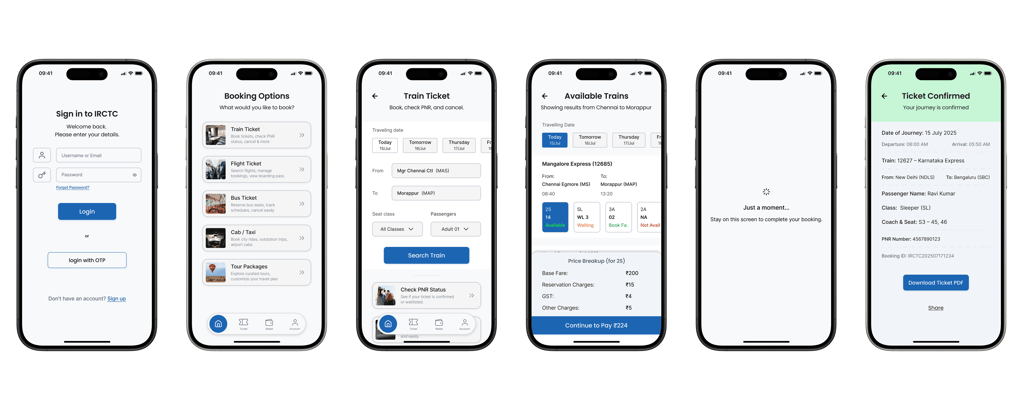
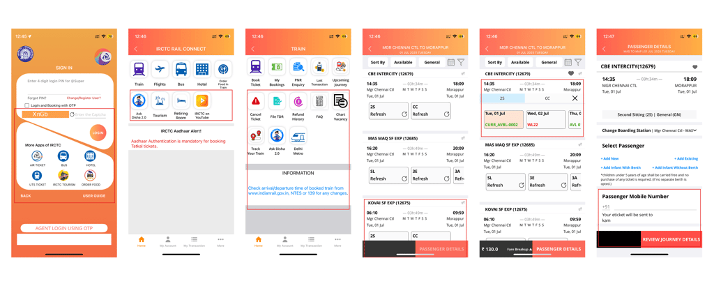
Final Screens
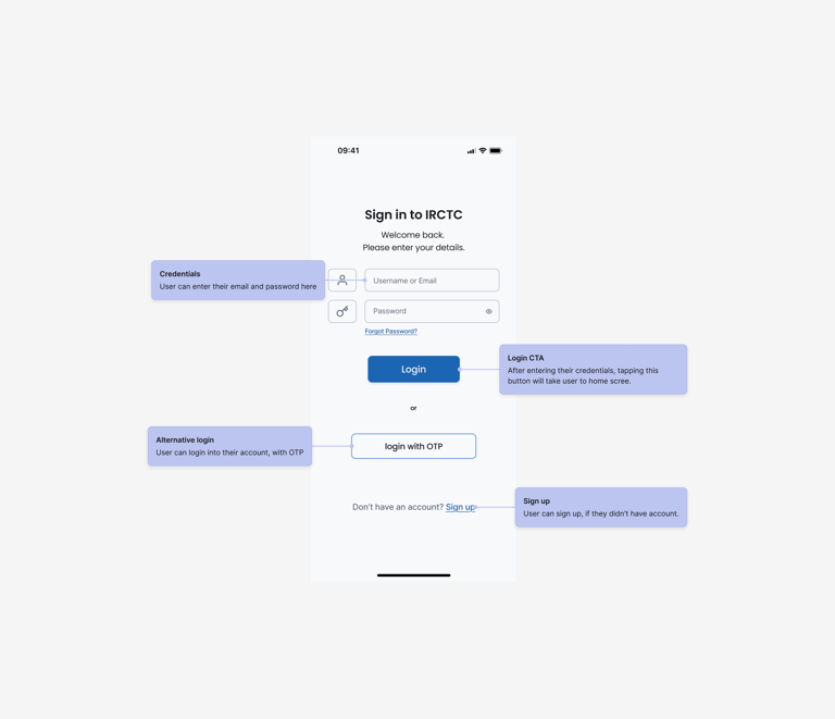
Login page
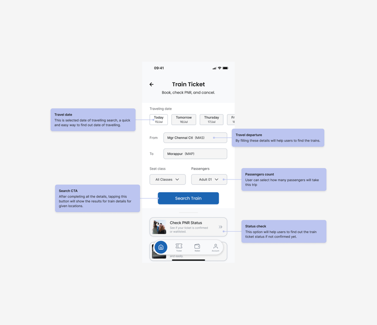
Booking details page
Enter from/to stations, date, and class. Clean layout for fast input.
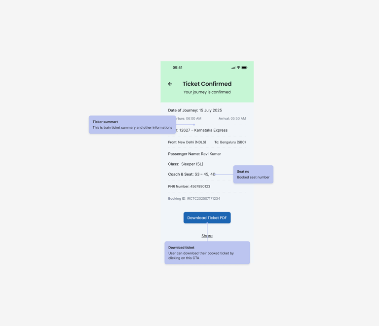
Train ticket page
Shows booked ticket with journey details, seat info, and booking status. Easy to access and download.
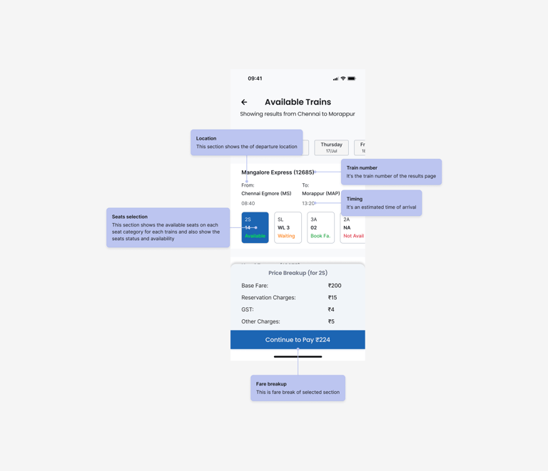
Train details page
Shows full route, stops, and seat info. Lets user pick class and check availability.
Confirmation page
Final review before payment. Shows journey, price, and passenger info clearly.
Hi-fi
The screen shows all important ticket details like passenger name, train number, seat, coach, and timing in a clean layout. Options to download, share, or add to calendar are placed clearly for quick actions after booking.